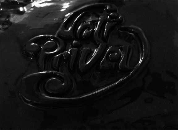
Anti Privacy
Anti Privacy I did this for Designcollector launch of their digital magazine for iPad download it here http://dcmag.net
Synopsis: I wanted to experiment with the word "Anti Privacy" one way I changed that up is by combining the " a & c" into one letter which plays a optical illusion and you end up seeing both letters at once. This wasn't made with some C4D trickery I hand carved the lettering out of wood, then applied black acrylic paint to the carving. Then I experimented with lighting techniques and a grainy camera then some touching up in PS. I wanted to give the effect of a sexual and ominous presence of the philosophical thought of public anti privacy and the social ramifications it would have now these philosophical and psychological questions I asked myself while doing this. Through my trend research I noticed some designer and artist have been playing with a “Doom (2012)” like quality in their work dark, dreary, depressing et cetera. In the coming years I believe this idea will become a more trending solution to some designers.
BLH